John Suder
Media Purveyor: Lessons Learned
Published Jan 06, 2019
Share
History
From some forgotten month in 2004 to March of 2006, I spent spare hours developing a media management application with a number of novel features. Convinced this innovation must equate to financial success, I left a salaried position to work full-time developing the product I thought would become a household name.
The first problem encountered on the road to making the product a household name was the name itself: Media Purveyor
Yikes! As a name “Media Purveyor” fails to be unique, exciting, or informative but excels at conveying an odd combination of boring, pompous, and vaguely creepy. I wish I could remember what I was thinking but I doubt I was thinking anything at all (an absence of any thinking is probably the most pervasive thinking error). I was an “engineer” and thought the name unimportant. Didn’t the The Bard have Juliet say “That which we call a rose By any other name would smell as sweet”? Perhaps. Even still, no one will buy roses labelled “Squelchy Stink Blooms”.
During the process of developing the product I learned many other valuable lessons but these lessons were not learned sufficiently early to save the venture. I ran out of my own money (never solicited VC) and returned to collecting a paycheck solving problems for other people who had done the hard work of finding paying customers and inventing good names.
A few days ago I found a copy of the Media Purveyor v2.9 installer (v3.4 or so was the last version) and decided to fire it up on my Windows 10 computer. I was shocked by many things. If you have a Windows OS I invite you to give it a try: Media Purveyor v2.9 Download (NOTE The uninstaller does work.)
First, I was shocked the application worked on a modern OS in 2020. Well mostly worked. One dialog popped down under a window rather than popping over so that I had to use Alt-Tab to find it. Also the application threw an error on exiting.
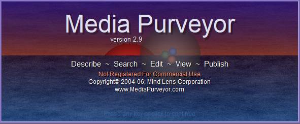
Second, I was impressed by how much is comically and avoidably wrong with the user experience. We’ll start with the hyper-animated title screen: You cannot tell from the static image but trust me when I tell you the water is… um… undulating is probably the word. Inside the transparent sphere you will spot small red, green, and blue spheres. These three orbs both spin and move in and out like a nauseating carnival amusement. Why are they doing that? I don’t know. I coded the effects but I honestly don’t know why. I do know that you score in the 90th percentile for stomach constitution if you can stare at this screen for longer than 45 seconds without losing your last meal.

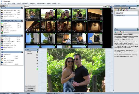
We move on to considering the main media browser screen. The image is scaled so it might be hard to tell but there are between 11 and 14 bazillion indicators, widgets, doodads, and things to press, click, slide, and twist. Almost every single surface can be right-clicked to reveal a dizzying array of additional options. Hovering over almost anything brings up a tooltip which is closer to a tool-novella. It is a kitchen sink interface with no sense of priority, proportion, weight, balance or flow.

That leads to the third major shock, and I apologize profusely if this has turned into a humblebrag, but I was proud of how much functionality had been built in the roughly 2,400 hours spent on development (another 800 hours were spent on marketing, help system / training materials, and customer support).
- Image Editor with 43 effects, layers, varying selection techniques, wizards, and more; all coded from the ground up based on research.
- Completely custom widget set built for this application with layout managers, custom styling, and effects.
- Browser with multi-threaded thumbnail loading (so the CPU could decode one while waiting on the I/O for another).
- Plugin based architecture for image editing effects, media decoders, encoders, metadata readers, etc..
- Slideshow
- File (en/de)cryption and filename obfuscation (creepy feature added because a co-worker suggested it)
- Many batch processing features (contact sheets, batch re-name with different strategies, conversion, scaling/sizing, etc..).
- On-line gallery publishing which would create a searchable on-line gallery as an AJAX application (cutting edge for 2006).
Remember when I claimed the application had some novel features that set it apart? Well none of the functionality listed above is really it!
Media Purveyor (ugh that name!) has one neat trick: it can read/write metadata from/to many different types of files without otherwise impacting the file contents. So what? Well it builds on that one trick to provide
- Portable Lossless Image Editing. The application can store multiple “views” of an image inside the source image file without having to re-encode (which for many formats causes a degradation in quality with each save).
- For example, you might take one very nice photo and create a view that crops the image one way and applies a blur.
- Another view may crop a different region and apply a sepia filter.
- A third view might apply an oil painting effect.
- That one file would contain the original plus three views and since the views are stored inside the file (as a lightweight set of commands) they are entirely portable from one device to the next.
- Portable keyword tagging and search. Keywords can be added to images and videos to support cross-cutting concern based searching. Rather than organizing media into artificial taxonomies / hierarchies, a media managers (marketing for example) can search an enormous catalog of media based on the Venn intersection of needs.
- Portable Schema-Less Data Entry. In addition to keywords, media can be described using user defined “Entry Screens” which are sets of fields (text, list, date, etc.). Each media file described with an Entry Screen contains enough of the Entry Screen schema to enable another client to also edit and search using that Entry Screen. The software has a method of managing portable Entry Screen identity and for dealing with discrepancies between schema versions.
Boldness and Focus
Ultimately, the value proposition consisted of portability, support for decentralized peer-to-peer sharing, and search by cross-cutting concerns (rather than organization by hierarchy).
I added features which competitors had (feature envy) rather than concentrating on this unique set of value propositions. In so doing, I squandered my competitive advantage by burying the unique value underneath a mountain of superfluous features that were probably better implemented by my competitors. I frequently see Product Owners struggle with this. It takes a certain boldness to believe enough in your product vision to have the courage to say “No, I won’t do that.”. My personal lack of conviction
- diluted the marketing message
- severely delayed time to market
- ruined the user interface
- increased ongoing engineering and support costs (code is a liability; everything you build must be supported)
Respect for Roles
I learned to respect all of the roles in the value chain; listing just a few here
- Sales and Marketing are two different very distinct disciplines and both are really hard.
- Gathering requirements is really hard.
- Good UX design is insanely hard. Design sprints, rapid prototyping, customer feedback, and the guidance of skilled designers are necessary to produce good user experiences.
- Good support / customer care requires a special kind of person that
- can be
- both empathetic to the suffering of users
- and impervious to user insults and vitriol
- while actively listening for the informational content in the communication.
- Being that person is… you guessed it… really hard. Eventually I even came to the view that users deserve respect even when they are trolling you. Supporting the product I received a lot of very colorful and impressively mean messages. After the stinging and burning sensations subsided I often found actionable insight in most of the e-mails (…most).
- can be
Not only did I learn to respect every role in a software organization but I learned the syngergy of communication.
When I began developing the product I would typically start with UX design or the Technical design of feature I thought would be awesome. This was a disastrous strategy.
By the end, I would consider every facet of the chain in determining what features to build
- can I sell this?
- can I market this? can I grab someone’s attention in a few words? explain this feature to a stranger in less than twenty words?
- can I write the documentation for this?
- can I support this when it breaks?
- how does adding this feature change the user perception of existing features?